Blue Apron is a meal delivery service that provides all the pre-measured, raw ingredients and instructions customers need to quickly prepare home-cooked meals. When I signed up for the service last year, I was pleasantly surprised by the concise, well-designed recipes that come with each set of ingredients. The folks at Blue Apron must have known their target demographic would include a lot of anxious, inexperienced cooks like me, and they clearly invested in a top-notch team of graphic designers, photographers, and writers to create their recipes.
Great instructional design is universal. It’s a systematic process that any expert can use to take a complex skill or concept and make it accessible to a non-expert. Whether you’re teaching someone how to make honey-butter fried chicken, a bridge that can support the weight of 100 cars, or a play that can move someone to tears, the essential dos and don’ts of effective lesson planning don’t change. Here are a few of my favorite instructional-design guidelines, which I was happily reminded of as Blue Apron helped me go from a nervous, mediocre cook to a slightly less nervous, halfway-decent one.
1. Start with inspiration and clear objectives.
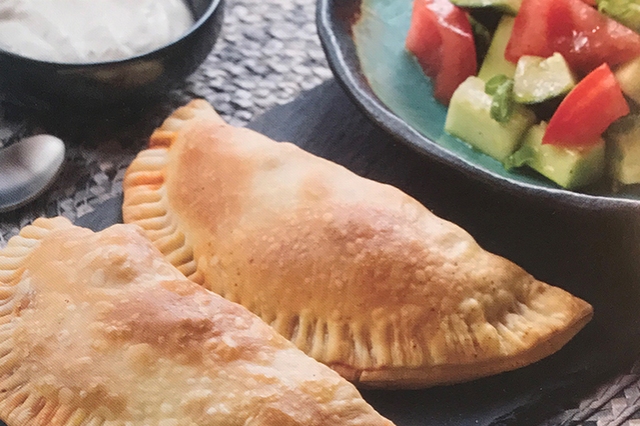
The front side of every Blue Apron recipe includes a large, beautiful photo of what you’ll create. The finished example is perfectly plated and well lit to ensure anyone who sees it will think, “I want to make that!”
While the assignments in your course might not always be as appealing as a golden-brown empanada or a glistening piece of glazed salmon, there’s usually a way to help students feel more inspired by sharing your passion for a topic and helping them see its relevance in their lives. Also, keep in mind that showing an example of the finished product provides more than just inspiration—it clarifies the goal of the lesson and ensures our aspiring “chefs” are all on the same page. While it’s important to have measurable objectives in online courses, objectives are always clearer when we can show students an example of an A+ submission.
2. Warn students about the time and resources they’ll need to commit.
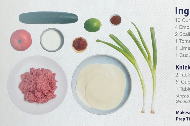
Every good recipe starts with an ingredient list and estimated cook time. A well-designed ingredient list might also include warnings like “divided” to ensure the cook realizes the ingredient won’t all be used at once.
Online courses need the same warnings before students begin a new unit of instruction. Many online instructors do a good job of warning students about hardware and software requirements, but we don’t typically take the time to provide a workload overview. This type of overview could take the form of a table that is shown at the start of each unit and includes the following information:
- total number of pages that must be read
- total minutes of video that must be watched
- number of discussions, papers, or other required assignments
- a general estimate of the amount of time the unit will require
3. Break down complex tasks into smaller, simpler tasks.
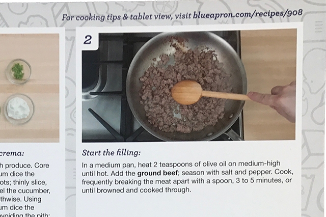
Well-designed recipes look for logical breakpoints and ensure tasks are grouped and ordered in the most efficient way possible. The back page of every Blue Apron recipe does a great job of this. Each step is clearly numbered and easy to process with minimal cognitive overload. All vegetables are chopped in the same step, sauces are typically prepared in advance, and a salad or side dish is often prepared last while the entrée finishes cooking. This focus on task clustering and order of operations helps ensure everything comes together at the right time and dinner is served in one perfect, piping-hot “ta-da” moment.
Whatever topic you’re teaching, it’s always challenging to determine how to break up a large lesson into smaller steps. While there are no hard-and-fast rules for how many sections and subsections a lesson should be divided into, some instructors find it helpful to follow the guideline that we can retain roughly seven items (plus or minus two) in short-term memory. This isn’t exactly a universal truth, but it’s a helpful starting point for considering short-term memory capacity when developing educational materials. In the case of Blue Apron recipes, there are always exactly six clearly numbered steps with photos and concise text that all fit beautifully onto a single page.
Web designers often use the “seven-plus-or-minus-two” rule when creating navigation menus. If the main navigation grows beyond seven items, a good designer will begin looking for ways to organize certain items into subsections. This same approach can be applied to online courses as we try to determine how many modules and submodules the course should contain and how many links to individual readings and assignments should appear when a student views a specific module or submodule.
Deciding how long a single segment of an instructional video should be is a bit trickier. While some experts swear that videos should never be longer than five minutes, others claim students can maintain focus for 10 or 20 minutes before they need a break. Whether you decide to stick to the low or high end of this range, keep in mind that the goal of segmenting video isn’t about pandering to short attention spans. Breaking long videos into smaller segments offers several practical benefits: students can better track their progress, easily pick up where they last left off, and quickly locate and review specific segments later.
Daniel Stanford is a Learning Design Consultant and former Director of Faculty Development and Technology Innovation at DePaul University's Center for Teaching and Learning. His work in online learning has received awards from the the POD Network, the Online Learning Consortium, NAFSA, the Instructional Technology Council, the University of Wisconsin, and Blackboard Inc. Follow @dstanford on Twitter | Connect on LinkedIn |


I enjoyed reading the comparison between following cooking recipes and designing online courses. I’ve taken a few online courses and admit that most have been well coordinated and designed. You learn to appreciate them when you come across a course that isn’t as organized. After the objectives you dug into the time it should take to complete a section of the course, such as a unit. This has helped me often in preparing my week. Reading takes me more time because I highlight text and take notes on the pages for future use (yes, I’m a paper book lover). When the week has a heavy reading schedule, I try to budget more time to it.
The third point of breaking down objectives into smaller tasks is harder. You know what you want the student to get out of the lesson. Yet not all students learn the same. So you need to incorporate different learning styles into a lesson, which, from what I’ve seen in various courses, is the toughest part of design. You need to be imaginative to develop ways to teach in a fluid manner so the lesson doesn’t jump erratically. You also need to cover all of the material in a timely fashion and ensure the students understand it. All the while the student needs to be able to track their progress through each lesson and through the course. This cookbook method is a good analogy of how to properly design a course. Thanks.
Thanks for the insights, Bobby. Glad you liked the post!